[13/2/23]
One of the main things I've learned as a consumer, is that branding is a very key aspect when promoting anything. Logo is the main thing consumers are attracted to as it is a visual representation of a product. That is why I decided to make one for our project, which would allow us to use it on all our related products such as music video, social media page and digipack.
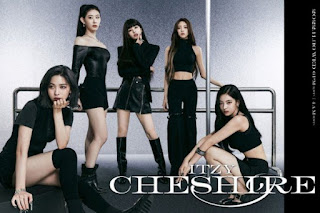
My number one inspiration for this comes from kpop, where an example can be taken from ITZY.
After I had arranged the pictures next to each other, I put the opacity of the pictures a tad low so that they look seamless. The picture on the right is the inverted version of the actual pictures as I did not want it to look like the same exact picture with the lightings in the same exact positions. ^
After cropping the picture to fit the 3 Instagram post dimensions, and adding texts indicating the artist name and the release date of the project, I was finally done with the first teaser. I had put a glitch effect on the text indicating the date as it looked too awkward and didn't look like it fit the theme. After the effect, the colors blended really nicely and looked complete. ^
The chesire logo was for the recent album called 'CHESHIRE', and as shown, they use this logo on all aspects of promotion which is very eye-catching and allows the audience to remember it.
After keeping in mind what I wanted, I logged into Canva and started browsing for artist logo templates that I could alter according to our project theme.
All these were very cute and unique, and after discussing with my teammates, we all decided to go with the very first one:
While still using Canva, I decided to work on Album Cover templates, for practice and to see the overall templates available for it. Looking and messing around made me come up with these :
Overall, there wasn't much variety on the templates of album covers however, I wanted to wait till the next shoots for more pictures and choose out of them.
The cake edit, posted above, was the beginning of the ideas I started coming up with for the social media account. I had went through many artist's social media's and this concept really stuck out to me:
This is the social media page for K-pop group ITZY , where they used a carousel type of Instagram post to promote their first English single. That is how I then wanted to post the teaser for our project as it wouldn't take up much space on the account feed. So after I was done editing the cake picture, which I knew would be perfect for a teaser, I went to picsart, a famous editing app, and started to see how I could put black fade outs on the sides of the picture so that the text would be more noticeable. Here's a step by step of what I did:
The original picture ^
Color graded the picture, adding purple tint, and lowering the exposure so the shadows would be darker, allowing the lights of the flame to be more prominent and bright.
I then put the picture on a 1500 x 500 white background so I'd be able to put darkness on the sides of the picture, so that the size would not be affected when posting it on Instagram, since I knew the picture would be too zoomed in if I did not do this. ^Next I took this picture, and put the exposure all the way down so only the lights would be visible as I needed a dark fade, not 3 pictures just next to each other.^
After cropping the picture to fit the 3 Instagram post dimensions, and adding texts indicating the artist name and the release date of the project, I was finally done with the first teaser. I had put a glitch effect on the text indicating the date as it looked too awkward and didn't look like it fit the theme. After the effect, the colors blended really nicely and looked complete. ^


.jpeg)


Comments
Post a Comment