[5/3/23]
My mother being a graphic designer herself, lent her Adobe Photoshop CD to me so I'd be able to use it easily for the digipack designing. After learning the basic of making it in school, it didn't take me much time to get used to it however I had a speculation that my app was a little outdated, so I did need to refer back to my teacher for the few hitches I had.
Downloading Adobe Photoshop^
Azka and Yumna both did not like the CD picture so instead I tried to use an old cake picture that wasn't used before. This was the outcome:
They both liked this one much much better. I still had trouble with realizing why the picture was so blurry so we decided to show our teacher tomorrow, Monday morning. In the meantime, I wanted to complete the social media page, since the panels were now finalized.
I used a Google powered app called Snapseed, to elongate the social media track list so that the actual picture and words wouldn't be covered up by the sticker I need to put at the bottom of the picture so that it blends seamlessly with the existing posts.
I then used Image Combiner again to combine the missing part of the pre-existing collage and the new picture:
After that, using this picture in picsart, I found the half missing flower sticker so that it looks like one big picture:
I had put the sticker a little too big on the pre-existing collage, so I couldn't reduce the size of the sticker otherwise it wouldn't have matched the collage. So it did end up elongating the picture a little bit more so no part of Aimen would be covered
. I, however still needed to color grade the sticker, which then turned out like this:
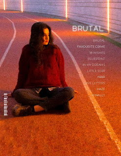
The next step was connecting the elongated top of the track list with the final picture, the album cover:
. I, however still needed to color grade the sticker, which then turned out like this:
However, seeing the amount of black made me realize how big the gap was which made it obvious that I tried to blend the edges. So I then decided to reduce the size of the elongated picture and fix the fade again:
In the above picture, I also reduced the elongation of the final cover. Then I added the fade and it turned out like this:
I liked this fade much more as it adds a certain darkness on the track that Aimen's sitting on. The only thing that was missing was the fade on the top of the cover so that it blends smoothly with the dark mode of Instagram:


.jpg)
.jpg)


.jpg)
.jpg)

Comments
Post a Comment