[4/3/23]
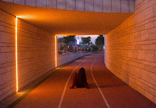
After picking pictures I found aesthetically pleasing, I edited them all and sent them to Yumna and Azka to select the favorites that will make it to album editing. The entire picture list was :
Out of these, whatever won't be chosen to the final front cover would then be considered for the other panels of the digipack, since I liked all the pictures, I let Yumna and Azka be the deciding factor. After sending these all, Azka and Yumna finalized these pictures:
Yumna, Azka and I all unanimously agreed that the very first picture should be the album cover, and that's how it was decided. I logged back into Canva and put the picture into the templates I found and liked. These were my results :
Azka and I both liked the placement and composition of the picture, following the rule of thirds, however Yumna suggested if we put Aimen in the middle of the frame. Trying the center composition:
Still not being able to decide one, we decided to ask our Media Sir for his opinion. While he said he liked the rule of thirds one, he told us to try reducing the noise from the picture. After editing the picture on Lightroom again, this was the final picture:
Looking at this picture, we all decided this was the one. The purple hints in the far distance of the picture added so much depth and further matched with the overall color scheme of the music video. This was the final album design:
After this was finally done, I started looking for track list templates, which were really almost to none. I then focused on the actual pictures I'll be using for the track list. I shortlisted these 3:
In the end, I chose the first 2 and last picture, I'll then shortlist one for the digipack and one for the social media page, so the same pictures won't be used however the sense of branding will still be present. The track list would be the back panel of the digipack. The final track list designs were:
I then decided to use the very first one for the back panel as it adds more color and fits the overall unity of the digipack. The last one I then decided for the social media page as it also matches the color scheme, therefore scraping the middle one.


.jpeg)

.jpeg)
.jpeg)

.jpeg)
.jpeg)

.jpeg)
.jpeg)


.jpeg)

.jpeg)
.jpeg)


.jpeg)

.jpeg)
.jpeg)

.jpeg)
.jpeg)

.jpg)
.jpg)


Comments
Post a Comment